The Do’s and Don’ts of Using Your New Logo
you’ve just received your new logo from vbg,
and we get is, you’re super excited to plaster it on everything (as you should be)! We want you to put your logo out there for everyone to see, but, most importantly, in a way that represents you new brand accurately.
accurately?! what do we mean by that?
Well, if you choose the correct formats of your logo, it will shine with the beauty it was intended to. But, if you use your new logo in am improper manner, it can actually miscommunicate your brand. We’re really big on communicating clearly. So, here are a few tools you can use today to improve the presentation of your new logo to the world. Ready to make it happen?
First things first, let’s talk about social media profile image.

The easiest and quickest way to get the word out about your brand or business is social media. With the use of platforms like Instagram and Facebook still on the rise, it’s important to make your debut on social media as aesthetically pleasing as possible.
Your logo is the first thing people see, so you want your first impression to be one that they remember. We want to make sure that you utilize your logo in the best way possible.
DON’T: TAKE YOUR LOGO FILE AND UPLOAD IT DIRECTLY AS A PROFILE PICTURE.
This can sometimes cause the edges of your logo to be cut off, which in turn creates a choppy and less professional look. We want to avoid this, especially since this is the first thing that people see when they come across your business or brand.

DO: INSTEAD, TRY PUTTING THE LOGO INTO CANVA FIRST.
Start with a Facebook profile photo template that is BLANK and add a square as the background. Make sure the background is one of your brand colors and then add your logo on top. Center your logo with room to spare on the edges so that you’ll have room for Instagram’s circular crop or Facebook’s square crop. Canva is an extremely helpful website with a large reservoir of designs and templates to help you make Instagram posts, posters, flyers, logos, or anything else your heart probably desires.
A SOLUTION THAT WE OFFER:
If you’re not feeling tech-savvy today, don’t fret! Our company can whip up those profile images for you. We will deliver the files designed specifically for your social media Profile Pictures so your brand will be ready for a great debut on the internet.

Contrast is Everything!
Again, aesthetics are super important to your brand’s identity. Although you have already received your ready-made logo, the backgrounds that you choose can make a huge difference in its overall presentation. We want to make sure that your logo is complemented by the background that it is posted on.
DON’T: PUT A DARK LOGO ON A SIMILARLY DARK BACKGROUND.
This can distort your brand message completely as it makes it hard for the eye to view & distinguish.
DO: INSTEAD, TRY PLACING THE LOGO ON A COMPLIMENTING BACKGROUND.
Here’s our general rule of thumb: it is safe to stick with a dark logo on a light background OR a light logo on a dark background. Good contrast is everything!
A SOLUTION THAT WE OFFER:
At The Visual Branding Group, our logo package offers both light AND dark versions of your logos. This way, you’ll have the tools you need whether your logo is showcased on a dark or light background. We offer this so that you can use your logo and implement it in the most visually pleasing ways as possible. Whether this is for a social media post, printing on a business card, or front and center of your website header, we’ve got your back!
PNGs, JPGs, and PDFs—Oh my!
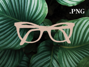
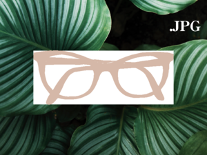
WHAT THE HECK IS THE DIFFERENCE BETWEEN A .PNG AND A .JPG?
Don’t worry, this is not a dumb question! People ask all the time! It is important to know about the types of files you have and which type is best for each specific use when implementing your brand logo. JPG and PNG are both types of files that are frequently used to store and format images, BUT .JPG files slap a white background on the back of your logo file, which turns into not-fun situations like this. PNG’s are much more friendly for everyday use, as they maintain a transparent background. See, doesn’t this look so much better?
DON’T: USE .PNG FILES WHEN TRYING TO PRINT, AS THE QUALITY WILL NOT BE MAINTAINED!
Let’s say you’re ready to put your logo on a fancy new business card. This is an example of when you would want to use a .pdf or a vector file, instead of a .png file. You want to use these types of files for business cards, flyers, stationery, etc.
DO: INSTEAD, TRY USING A .PNG FILE FOR POSTING YOUR LOGO ONLINE.
The transparent background is ideal for this and looks best when posting on your website or using it to convert into a profile picture.
SOLUTIONS THAT WE OFFER:
If there are any tech questions that you have, never hesitate to ask when working with us to create and voice your brand’s identity. Especially when it comes to which type of file to use, we can offer a helping hand and second opinion on what will complement your brand, logo, and images in the best way possible.